Tattoo styles compared: how each one looks fresh and how it ages
Style labels are shorthand, and they matter mainly because they tell you which artist to look for and how the piece is likely to look in ten years. Here is how the common styles compare side by side.
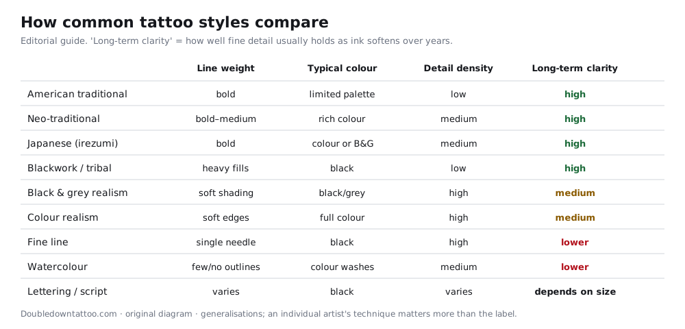
Bold-line families: traditional, neo-traditional, Japanese
American traditional uses heavy black outlines, a limited palette and simple shading. Its strength is legibility: you can read it from across a room, and it tends to stay readable for decades. Neo-traditional keeps the strong outline but adds varied line weights, richer colour and more depth, so it looks more painterly while staying sturdy. Japanese (irezumi) is a tradition with its own subjects, background elements (wind, water, clouds) and conventions about how large pieces are composed. It is often planned as a sleeve or back piece from the start, so look for an artist who does that work regularly.
Blackwork, tribal and dotwork
Large areas of solid black, geometric patterns and stippled shading. Solid black has the strongest contrast of anything you can put in skin, and well-packed blackwork holds up well. It is also the hardest to cover or remove later, so commit only if you're sure.
Realism (black & grey or colour)
Portraits, animals and photo-like scenes built from soft shading rather than outlines. Realism depends on fine tonal steps. Over time those steps can flatten if the piece is small or kept in the sun, so realism generally needs size. A palm-sized portrait is a bigger risk than a forearm-sized one. Choose an artist whose healed realism (one year or more) you've actually seen.
Fine line, micro and single-needle
Delicate lines and small detail. It looks beautiful fresh, but fine lines are more likely to soften or break up over the years, especially on hands, fingers and feet. We cover the trade-offs on a dedicated fine-line page.
Watercolour and sketch
Soft colour washes, sometimes with little or no outline. Without a dark outline, edges rely on colour contrast alone, which can fade, so many artists now add a light black structure underneath. Ask how they handle this.
Lettering and script
Lettering depends almost entirely on size and spacing. A good lettering artist will adjust the letter shapes for skin, but very small lettering with closed loops is a common reason for touch-ups later.
How to choose between two styles you like
- Placement and size: small and on a high-friction area (hand, wrist, foot)? Favour bolder styles.
- Sun: if the spot will often be in the sun, plan for high contrast and simple shapes. UV exposure is a well-known cause of fading.
- Future plans: if this may grow into a sleeve, choose a style that a single artist can extend consistently.
- The artist: a specialist in one style will usually do better work than a generalist doing everything.
Basis of this page
This is an editorial comparison with no medical claims, so no medical sources are cited. Style descriptions follow widely used naming conventions in the tattoo trade; the ageing notes are generalisations, not measurements. The one physical point, that sun exposure fades tattoos, is covered with sources on our colour vs black and grey page.